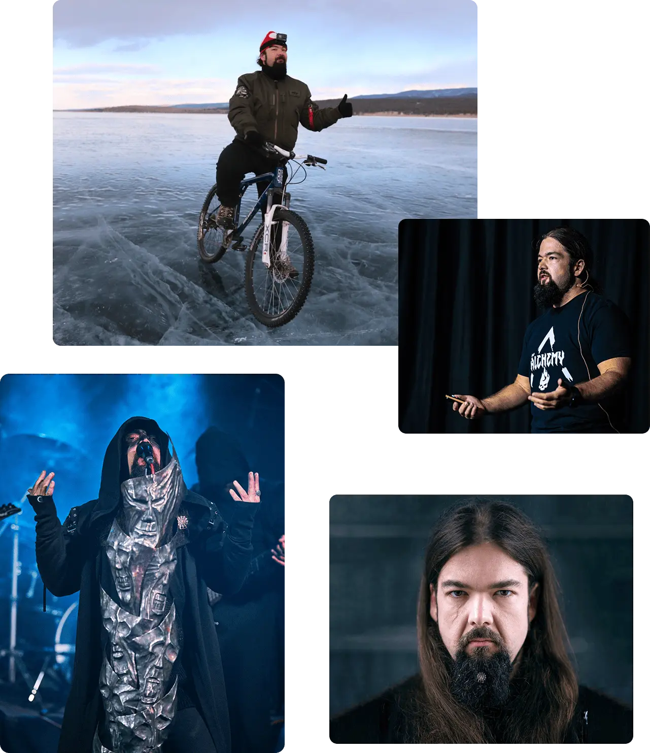
loading
comments ›
close
Home
loading

Categories

RSS 2.0 / RSS .92 / Atom 0.3

Archives

 
loading
 

On meditation

Published on , in Ranting, Dreams
I meditated for the first time today, in a Buddhist temple in South Korea. Being non-spiritual, I didn't expect much - actually, I expected it to be boring. However, I got an unexpected treat, a show for free, courtesy of mild hallucinations. I googled a bit to see if this is a common thing, but the results were wildly spiritual-enlightened-mumbo-jumbo, which couldn't have been the case here. Being a very fanciful and vivid dreamer, I'd think it was something more down that alley.

We did two sessions, a 20 minute one and a 30 minute one. The first one was richer for me, as I could just concentrate on the floor patterns, without any distractions. In that session, the floor patterns first started weaving to the sound of the rain before turning into shapes. The first shape was a demonic-kind of face, that was in turn eaten by a huge flame. After some more dancing patterns, I got one more scene of a mouse nibbling on a wooden horse, that in turn morphed into a mouse winding up a human-like shape (a nutcracker soldier kind of thing). That's when our session ended. My eyes were a bit misaligned after that, as all the people had two mouths and four eyes, which was amazing as well.

After a breakfast and a break, we did a second session. This time, I wanted to concentrate on the rain drops outside the meditation room. First thing that I noticed is that it's a lot harder to form patterns in an environment that is already dancing, but worse still was having a constantly moving person in my sight. When I managed to zone that out, I first saw regular pattern flows, forming infinity symbols and triskels. Eventually came the first scene: two guys doing some martial-arts fighting with long sticks. When they were done, the puddles and raindrops in them became intensively 3D and were gaining more and more height. Then the signal turned to noise for a long while, before turning into an epic ship fight, with sails, cannons and explosions. While concentrated on the scene, a gust of wind moved the trees in the background, which made it look like the mountain was about to get up and walk away. It also resembled a waking dragon a little bit, so I moved my eyes to concentrate on that, which broke the flow. After that it became uncomfortable sitting on the floor, so that was essentially the end of my trip.

It was an interesting experience - being fully rested and awake, yet dreaming with the eyes open and not even remotely feeling like falling asleep. I'll have to try to recreate the experience back home.


NOT Printing a wall-sized map (an alternative)

Published on , in Ranting

Prologue

As you know, I like to travel. And as most of avid travellers out there, I like keeping a nice log of the places I've been. Everybody and their dog has some sort of a digital map with flags, which is convenient, easily updatable but for me — very impersonal. Back in 2011., when most of my ventures were bound to Europe, I just went and bought the biggest paper map of Europe I could find, printed loads of tiny flags and stuck them onto the map. The end result was both simple and beautiful:

Good ol' times
Good ol' times

However satisfying at the time, that map was not a long-term solution as it became insufficient that very same year, when I went to Finland and realised that most of it is not on this map I bought. At that point, I started considering getting a big, high resolution map of the world, but such a thing was not available in Serbia and I parked the idea until it became more of an issue.

Several months later, I moved to Amsterdam. While decorating my rental apartment, I was constantly thinking about where could I place the bigger brother of the map that I left home, but it didn't seem to fit. Then I started travelling outside Europe a lot, which made it clear that I would need a really big map for which there was no room in that apartment. Fast forward three years: I bought a bigger apartment and after all the decorating I was left with one relatively big and empty wall, in the so-called study.

The problem

Even though I expected otherwise, high resolution paper maps of the world are not easy to find. The maps I could find online were either too small, too childish or with too much accent on features I was not interested in. I just wanted as plain as possible political map with as many cities as possible, which would be around 2.2m wide. Apparently, that's too much to ask for. Then, I ran into a fantastic article by Dominik Schwarz on how to print a map that would satisfy most of my needs. Eagerly, I followed his advice on creating a huge, detailed print file and while my computer was busy stitching it, I started exploring printing and plastering alternatives in Netherlands (thinking it would be a bit of a hassle getting everything shipped from Germany). Then I realised one important thing: my wall is almost 1m shorter than Dominik's. Opening the huge map file in Photoshop and adjusting its print size to the available wall size revealed that the city names are no longer readable. It also revealed one other problem: if I were to place the map where I intended to, I would have to re-wire the light switch, because it would have to be behind the map. Since I was already in sour grapes mode, I added one more problem: I don't really like Mercator projection used by Google. The whole "Greenland looks as big as Africa" is not really my thing.

The solution

Then I started re-evaluating: what exactly is important to me and how can I achieve it. I wanted a political map with not too much text that would hold "flags" of places I've been to and fit the specific wall-size. When you remove the text, it becomes a lot easier. Namely, I should recognise the countries I've been to; while for the "overview-type" map I care more about the distribution of the "flags" than about the precise representation of the each one. That revealed another point: high-resolution was not mandatory either. So, how do you achieve a "low resolution" on something 2.2m wide? Using a sharpie.


Look, Ma, I'm using the ironing board!

Even though in this photo you can see a huge bunch of sharpies, in the end I only needed 3: a black 1mm "CD/DVD marker" for land outlines, a black 0.4mm "fineliner" for country borders and a red 0.4mm "fineliner" for cities. The map that I decided to use as a guideline is actually of a fairly high resolution — way higher than 1920x1080 deliverable by the projector — but even though I originally wanted to split the wall in 3x3 segments in order to get a virtual 5760x3240 resolution, I realised that I don't have the means to position the projector in such a way to cover all of those quadrants, so I settled with the low resolution and... it's Good Enough™:

The finished productThe finished product

It took a couple of hours to finish (a lot less than I expected) and it cost €1.4 (I borrowed the projector from my workplace). For that price, I'm ok that some country borders are a bit approximated. Yes, it's not the best map ever made but it fulfils all of my criteria with the added bonus that it's as personal as it gets.

Final words

I thought there would be more red dots

In case you decide to do this with your wall, I would say: just go for it. It's easy, fast and margin for error is very minimal. Also, I've been reading all kinds of posts about the "science" of wall-tracing (where should you put the projector, how should you distort the image, etc.) and, personally, I call bull. As you can see from one of the previous photos, the projector was in a sub-optimal position, but I managed not to block the light and easily trace the borders. Speaking of which, I absolutely love the thickness contrast between the land borders and the country borders — and I think you would too — but maybe you'd want to re-consider the thickness (and maybe even colour) of the city marker as the red dots are very subtle. For me, it works, as it's not too distracting and it takes a bit of "exploration" to see where I went, but if you want it to be more in-your-face, I'd go for a thicker marker.


Finally, if you have your own take on putting a big map on your wall, I'd like to know how it went, so do drop me a line!


On the mirror's edge

Published on , in Ranting
Deep down. Dark reflection, no sound. I'm sitting on a ledge, staring into the deep. Mirror image is so sharp and inviting. To my left is a 4-storey building, under water. In front of me are some boats and occasional cyclists. I check the roof ornaments again, staring into the deep. I realise how this moment is wasted on me, as the mist draws over the mirror, arbitrarily. I'm hoping for a wave, but nothing disrupts this razor-sharp image. 
I intend to come here again, sober, happy and with a camera. I intend to steal this moment, wishing I could do it without thinking of you, even though I want to share it with you.
I pull back, trying not to succumb.


Het Scheepvaartmuseum and NEMO

Published on , in Ranting, Netherlands
This Sunday I did something I wanted to do for years - visit Het Scheepvaartmuseum and NEMO.

Het Scheepvaartmuseum has been on my list since the first time I was in Netherlands, but at that time it was under re-construction (as it was my second time around). Over the time, my interest only grew, thanks to a relatively recent discovery of my weird fascination with all things maritime, which has manifested itself through visits to a number of harbour-cities and their maritime museums. Het Scheepvaartmuseum might not be as rich as Hamburg's Altonaer Museum, but the installations are fairly interesting for a quick couple of hours' browse. The replica of East-Indian Amsterdam might not be as fun as the replica of her Scandinavian counterpart Götheborg, but she's still a mighty fine vessel. Overall, you can't go wrong if you're interested in the sea.

On the other hand, NEMO was a complete disappointment.
I did know that it was kids-oriented, which is why I was weary of it in the times past. But in 2010 I visited Universeum, another kids-oriented science/nature museum, and was completely stunned by things it offered. Expecting something alike, I was very eager to get to NEMO. Unfortunately, I realised it was nothing but a fancy kids' playground, with very little left to be imagined for the adults.
I hate to say it, but the most interesting part for me was getting out on the roof terrace. The view from there is amazing, and I was lucky to get some sunshine. Still, that is something you can do without even getting into the museum.

Bottom line - Het Scheepvaartmuseum: Good; NEMO: Bad.


Panoramas!

Published on , in Ranting
As you have probably noticed, I have next to no time to fiddle with my own website further than adding new galleries or updating data in either sites or skills sections (not to mention that I have blogged barely twice in last two years).
Well, uni's over, work has kicked in and all the free time has gone into travelling and sorting out photos (which is taking way more time than it used to ever since I found out about HDR and more recently have gone dSLR).

Anyway, last couple of days I've been playing with both new and old panoramas I've taken over time and have decided to publish all of them here, as an additional gallery in photos.

So, go ahead and check them out!


  Facebook Dachaz - GTalk [email protected] - Skype darko.zelic - mobile +31639107668 - Mail [email protected] - Twitter @Dachaz -